


Results 1 to 15 of 135
 LinkBack URL
 About LinkBacks
Hybrid View
-
01-21-2008 08:22 AM #1
 CHR Member

- Join Date
- Apr 2001
- Location
- Salado
- Car Year, Make, Model: 32, 40 Fords,
- Posts
- 10,898
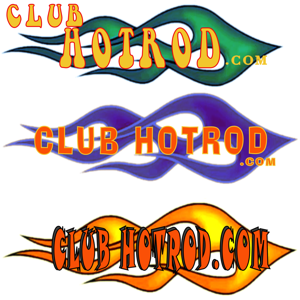
Just a little history on the current logo. When the site first came online Brent slapped together something just to have, well, something. One of the earlier members had some artsy skill and started playing around with some ideas from whence the Chrome looking "Club" and the flame within the "Hot Rod" evolved. Another suggestion was added with the profile of the chopped coupe, then the driver was later added with the arm out the window "profilin' " look. The "Great....." verbage was a carryover from Brent's original logo. It's remained pretty much intact for roughly 6 years in it's current form.
Now some comments on logo design without trying to squelch any contributions, afterall, we're tossing out ideas here to see what sticks and it all contributes to the inspirational flow. The essence of logo identification is quick and ready recognition. As such, the most effective logos are simple yet stylish. They have an instant recognition factor, think Nike swoosh, Coca-Cola script, Ford blue oval and distinctive script, Chevy bowtie, and so on. Sometimes it's expanded with some secondary descriptor, again Coca-Cola subtitled with "It's the real thing". The temptation when doing a logo is trying to be all things to all people. The more you focus on creating the logo to "hit as many bases as possible" the more jumbled it becomes............and in my opinion, less attractive and functional. In advertising this is an old pitfall with billboards (and not surprisingly in the internet a homepage logo is a good comparative). The amatuer designers of billboards would try to pack in as much info as possible. That works fine when you're at the design board and have time to read everything you've stuffed on the board. However, the target audience has less than 7 seconds to read what you've got for your message. The savvy designers learned to be brief and pointed in their message. While we're not a billboard on the highway, the concept is still the same. If you try to be all things to all people you end up being nothing to everyone.
Now we're not trying to sell anything here, so our lives don't depend on the effectiveness of our message, but I think some of the principles apply. When someone stumbles into the site, a ready recognition of what we're about should be quickly and easily apparent to them. If we move onto the next phase of perhaps making up hats/shirts/jackets/whatever, then we want something that will be easily distinguished at a glance, perhaps from a reasonable distance, so that folks who've agreed to meet at an event but don't know each other by sight, can easily identify the logo rather than something that may resemble a map of the new world. JMHO
So let the ideas continue to flow.Last edited by Bob Parmenter; 01-21-2008 at 10:13 AM.
Your Uncle Bob, Senior Geezer Curmudgeon
It's much easier to promise someone a "free" ride on the wagon than to urge them to pull it.
Luck occurs when preparation and opportunity converge.
-
01-21-2008 08:41 AM #2
CHR Member
- Join Date
- Feb 2004
- Location
- Tucson
- Car Year, Make, Model: 39 Ford Coupe, 32 Ford Roadster
- Posts
- 2,334
Good info Bob....
The logo design should also consider the three reproduction methods that could be used (get your mind out of the gutter!).....print media such as a web page, silkscreening such as on a t-shirt or jacket, and embrodiery like on a hat or polo shirt. Print media can reproduce any number of colors, any resolution, etc without a problem. Silkscreening can reproduce most detail but each color requires a stencil to be burned. Silkscreening on hats looks cheap...hats with adjust straps in back look cheap also. Embrodiery is the least resolution friendly....the logo is usually small anyway (think hat logo) and the stitching coarseness makes the detail even worse. Therefore, designs with small writing, tiny detail, etc are difficult to reproduce.
In my opinion, a good logo should be stylized, have minimal text, and convey the message that CHR is associated with hotrods (kinda what Bob said). Unless the wearer has a large chest and is female, the viewer shouldnt have to get close and spend time analyzing some small print!
Mike in Tucson
-
01-21-2008 09:36 AM #3
CHR Member
- Join Date
- Dec 2006
- Location
- Fruita
- Car Year, Make, Model: 39 Chevy Pickup
- Posts
- 51
I have to remember that one. "hey man, I was just reading her shirt" Originally Posted by robot

 BoneheadCustomz.com
-
01-21-2008 11:09 AM #4
CHR Member
- Join Date
- Dec 2006
- Location
- Fruita
- Car Year, Make, Model: 39 Chevy Pickup
- Posts
- 51
 BoneheadCustomz.com
 Reply With Quote

Posting Permissions
- You may not post new threads
- You may not post replies
- You may not post attachments
- You may not edit your posts

Yep. It’s pretty sad.
Dead!