


 258Likes
Thread: 41 Willys Gasser project


Results 1,051 to 1,065 of 1724
 LinkBack URL
 About LinkBacks
-
06-14-2012 12:50 PM #1051
 CHR Member/Contributor

- Join Date
- Sep 2007
- Location
- Gardner, KS
- Car Year, Make, Model: '33 HiBoy Coupe, '32 HiBoy Roadster
- Posts
- 11,245
Yeah, I like No 1 best and the difference in font is not a problem at all, to my eye. The "Willys" is traditional block, and having the "Supercharged" in a mild script slant just adds to the highlight. I think it would look worse if it matched the block letters above, but that's just me.Roger
Enjoy the little things in life, and you may look back one day and realize that they were really the BIG things.
-
Advertising

- Google Adsense
- REGISTERED USERS DO NOT SEE THIS AD
-
06-14-2012 12:50 PM #1052
CHR Member
- Join Date
- Jan 2004
- Location
- Macomb
- Car Year, Make, Model: '32 Ford 3W Coupe, 383 sbc
- Posts
- 1,593
I like location on the top of hood next to the blower scoop.
Lynn
'32 3W
There's no 12 step program for stupid!
http://photo.net/photos/Lynn%20Johanson
-
06-14-2012 12:57 PM #1053
CHR Member
- Join Date
- Sep 2007
- Location
- New Bedford
- Car Year, Make, Model: 34 Ford 3W Coupe Replica
- Posts
- 14,754
How about a slight variation of the # 1 choice? Above the trim centered over the Willys...
-
06-14-2012 01:49 PM #1054
CHR Member
- Join Date
- Feb 2010
- Location
- Pukekohe, New Zealand
- Car Year, Make, Model: '23 Ford T Roadster
- Posts
- 2,199
Differently under the Willys badge is my vote Steve. The little corner pieces you made up for at the bottom corner of the bonnet, hood for our American friends, is that part of the pillar or guard or separate altogether and what did the original Willys have?????I maybe a little crazy but it stops me going insane.
Isaiah 48: 17,18.
Mark.
-
06-15-2012 07:28 AM #1055
CHR Member
- Join Date
- Oct 2007
- Location
- Littleton
- Car Year, Make, Model: 31 ford five window
- Posts
- 156
I think my vote is on number one as well!
Great job on a cool build! Thank you for sharing it with us.
Is she a driver yet?Scott
31 Ford five window
-
06-15-2012 10:41 AM #1056
CHR Member
- Join Date
- Apr 2009
- Location
- watford
- Car Year, Make, Model: 26T Coupe, 32 Roadster, 41 Willys Coupe
- Posts
- 2,363
I think that's where it's gonna end up Roger Originally Posted by rspears

.Its aweful lonesome in the saddle since my horse died.
-
06-15-2012 10:43 AM #1057
CHR Member
- Join Date
- Apr 2009
- Location
- watford
- Car Year, Make, Model: 26T Coupe, 32 Roadster, 41 Willys Coupe
- Posts
- 2,363
Yeah that's a strong contender Lynn Originally Posted by rumrumm
.Its aweful lonesome in the saddle since my horse died.
-
06-15-2012 10:44 AM #1058
CHR Member
- Join Date
- Apr 2009
- Location
- watford
- Car Year, Make, Model: 26T Coupe, 32 Roadster, 41 Willys Coupe
- Posts
- 2,363
I kinda like it there too but I have a "powered by" lettering going there Originally Posted by 34_40
.Its aweful lonesome in the saddle since my horse died.
-
06-15-2012 10:46 AM #1059
CHR Member
- Join Date
- Apr 2009
- Location
- watford
- Car Year, Make, Model: 26T Coupe, 32 Roadster, 41 Willys Coupe
- Posts
- 2,363
Not sure Whip, can't find a pic of that area, these are glued to the fender Originally Posted by Whiplash23T
.Its aweful lonesome in the saddle since my horse died.
-
06-15-2012 10:47 AM #1060
CHR Member
- Join Date
- Apr 2009
- Location
- watford
- Car Year, Make, Model: 26T Coupe, 32 Roadster, 41 Willys Coupe
- Posts
- 2,363
Thanks for the kind compliment mate, still work to before start up though. Originally Posted by ScooterCO
.Its aweful lonesome in the saddle since my horse died.
-
06-15-2012 12:57 PM #1061
CHR Member
- Join Date
- Jan 2006
- Location
- Constantine
- Car Year, Make, Model: 57 chevy 2 dr wagon
- Posts
- 9,476
#7 but lower and a little farther backCharlie
Lovin' what I do and doing what I love
Some guys can fix broken NO ONE can fix STUPID
W8AMR
http://fishertrains94.webs.com/
Christian in training
-
06-15-2012 03:35 PM #1062
CHR Member
- Join Date
- Feb 2010
- Location
- Pukekohe, New Zealand
- Car Year, Make, Model: '23 Ford T Roadster
- Posts
- 2,199
Hey Steve, you could always ask KiwiKev that Willys nutter on that other site to take some close up photos of that area for both of us to learn from, oh he is having surgery on his wrist soon so maybe a while before we get an answer but an idea. He is really a nice guy by the way him being a Nude Zeelunda.
I maybe a little crazy but it stops me going insane.
Isaiah 48: 17,18.
Mark.
-
06-16-2012 01:24 AM #1063
CHR Member
- Join Date
- Apr 2009
- Location
- watford
- Car Year, Make, Model: 26T Coupe, 32 Roadster, 41 Willys Coupe
- Posts
- 2,363
Yeah I know Kev, very nice chap and very helpful Whip Originally Posted by Whiplash23T
.Its aweful lonesome in the saddle since my horse died.
-
06-16-2012 12:10 PM #1064
CHR Member
- Join Date
- Apr 2009
- Location
- watford
- Car Year, Make, Model: 26T Coupe, 32 Roadster, 41 Willys Coupe
- Posts
- 2,363
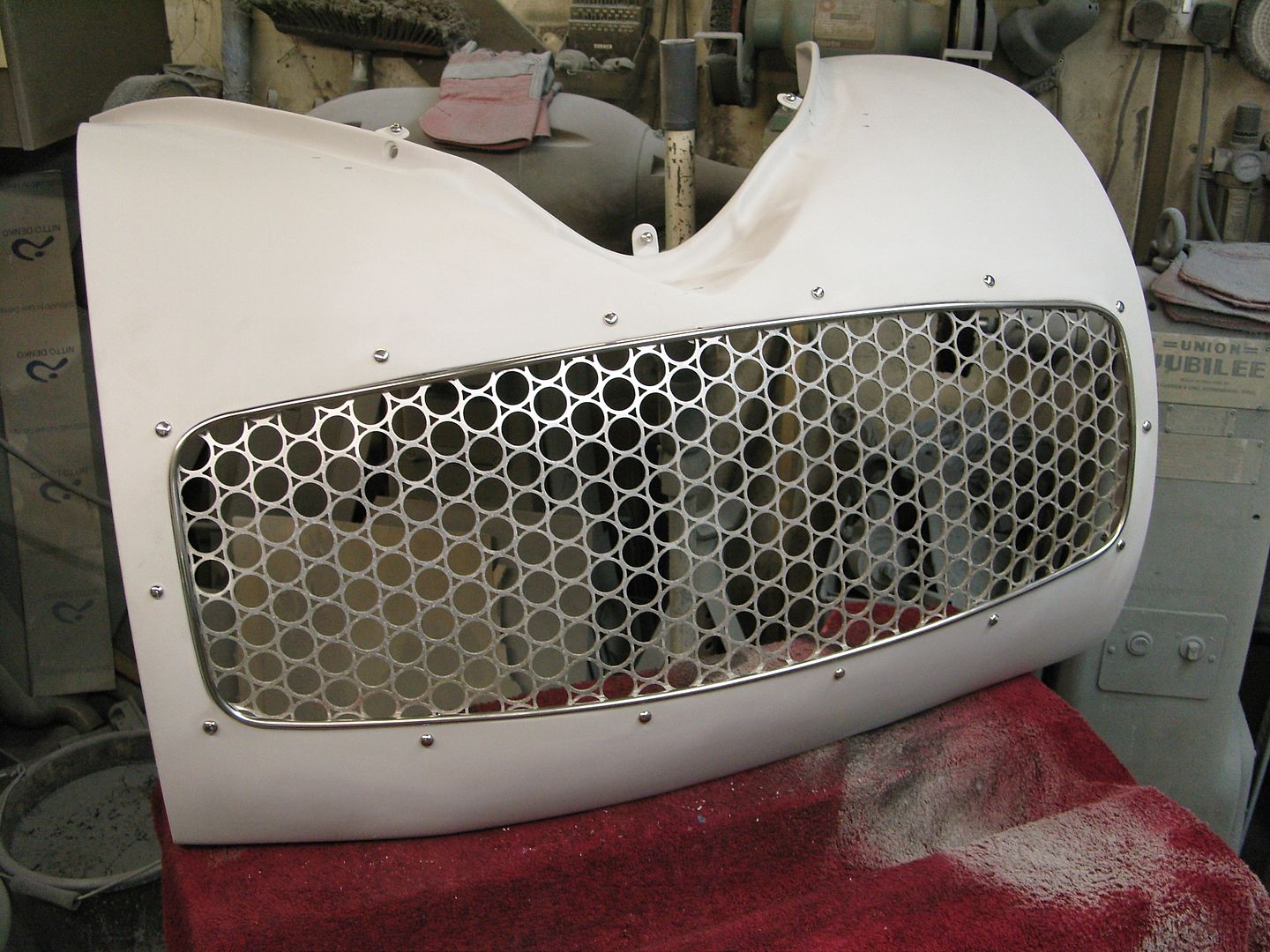
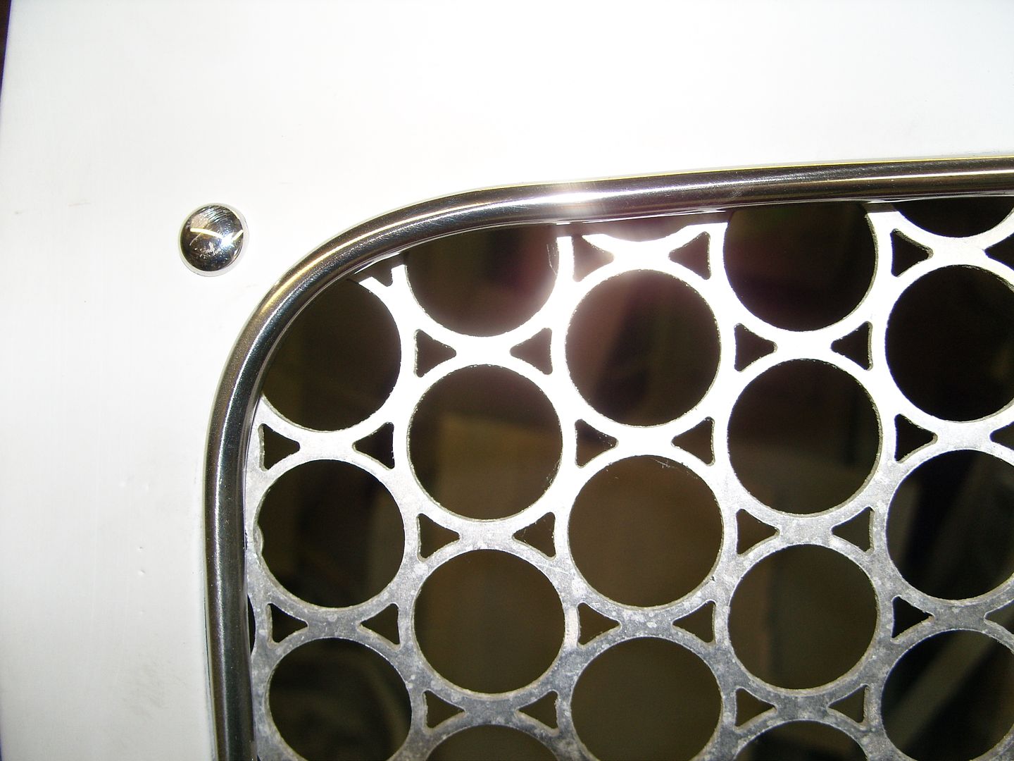
Mostly very windy & showers here today so a workshop job had to be found, Been looking at the fairlane grille and thinking it needed a surround, I found some 1/4" annealed stainless thick walled tube that would bend easily so made up a surround, Its held in place by 4mm screws from the back which screw into tapped holes in the back of the surround.
This is how it looked
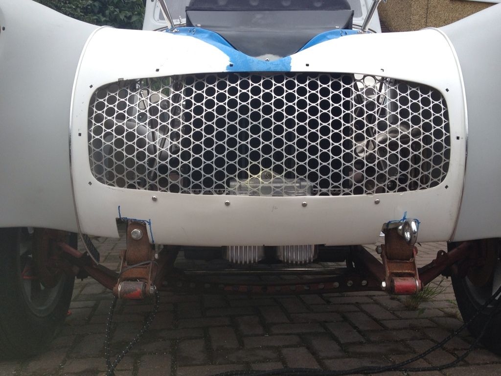
With the surround
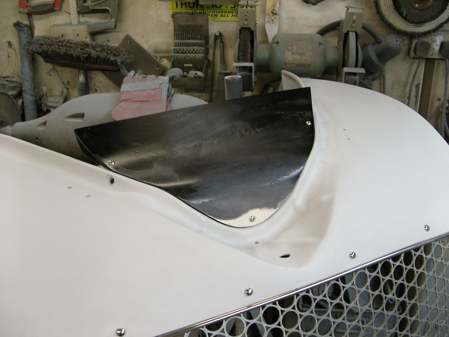
Willys are well known to have cooling issues due to the rad being high, I made up an air deflector to make sure all the air went through the radiator.
.Its aweful lonesome in the saddle since my horse died.
-
06-16-2012 02:58 PM #1065
CHR Member
- Join Date
- Feb 2010
- Location
- Pukekohe, New Zealand
- Car Year, Make, Model: '23 Ford T Roadster
- Posts
- 2,199
Amazing how that has improved the look of the grille Steve,very nice and heck, I hope there is a excellent discount when you buy stainless steel as you must be their best customer?
I maybe a little crazy but it stops me going insane.
Isaiah 48: 17,18.
Mark.
 Reply With Quote

Posting Permissions
- You may not post new threads
- You may not post replies
- You may not post attachments
- You may not edit your posts

Turn out the lights, the party's over THIS PLACE IS DEAD!
Dead!